Waymo's Driverless Car: Ghost-Riding in a Robot Taxi
My Roles
UX Design and Research
UX Design
Project Background
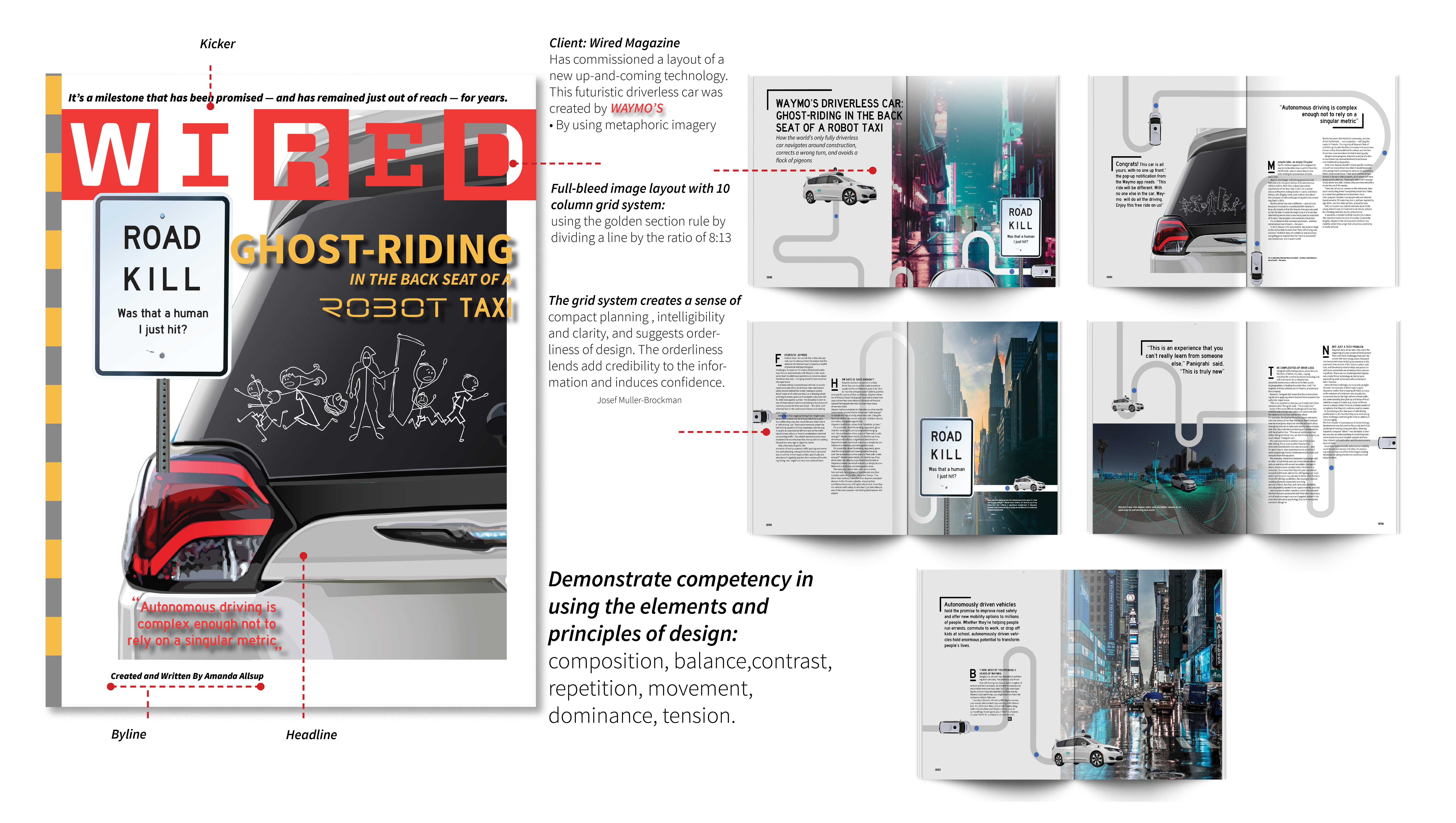
Wired (stylized as WIRED) is a monthly American magazine, published in print and online editions, that focuses on how emerging technologies affect culture, the economy, and politics. This project was a stand-alone design visualization of tightly contextualized material in a color printed, 17″x 22″/22″x 17″surface area. The reading experience makes it possible for users with no prior knowledge of S.T.E.E.P. analysis to effectively and easily understand its contextual situation. (“In other words, readership could convert information to knowledge with minimal effort.”)
Complex data sets are simplified, allowing readers to:
Digest information
Be emotionally motivated
Accept a call to action
These 3 together are known as the “empathic triangle.”
My design effectively facilitates responses in each of these. Graphically and typographically expressing the “amalgam of information” described in the previous criterion makes it aesthetically compelling as a visual system; the composition of the entire piece is, on the whole, well-organized. It creates a reading experience that promotes rather than inhibits their ability to engage in comparison, contrast and contextualizing (“the three C’s”) the information they were presented as typography, imagery, symbols, the assertion of color(s), and, ultimately, the combination of all of these.
Task And Mission
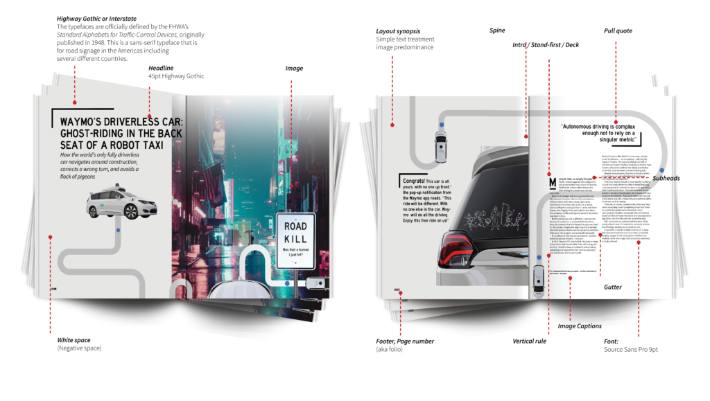
The typographic elements are configured so that they reside within the total graphic landscape of the composition, while their proximity to each other facilitates rather than inhibits reader navigation.
Horizontal and vertical negative spaces between content modules were arranged so as to:
Avoid “trapping” internal negative space
Avoid creating “leftover,” or unresolved negative spaces in the areas that constituted the four (north, south, east, west) edge areas of the composition
Allowed enough “breathing space” throughout the composition to allow readership to effectively navigate from one area to another
Effectively deploy secondary, formal typographic variables such as alignment thresholds, assertion of varied typographic weight, postures and levels of extension or condensation, and letter spacing to support the perception of viable hierarchies of information:
Throughout the entirety of your composition
In each of the modules of information that constituted it
Effectively integrate the typographic elements in the composition with image-based elements, symbols, and graphic presentation of maps, charts, and diagrams.
Effectively deploy variations in hue, chroma and value throughout the color palette that imbued the composition to:
Reinforce an effective hierarchy of information
Effectively create perceptions of grouping and separation among principal elements
Evoke appropriate emotional responses given your subject matter
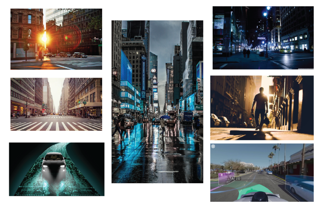
Effectively rendered or made use of originally generated illustrations, photography and other imagery to support readerships abilities to interpret the primary and secondary ideas.
DISCOVERY
Sketches
Low-fidelity ideation in order to visualize initial concepts. Click to View
If your organization sees the value in UX research and design use the button below for contact information to discuss opportunities or to just say hello!